Removing Hidden Constraints to Solve the Right Problems
The United States Tax Court:
Case Management System

Project Summary
I led a multi-disciplinary team to research, design, and launch a green-field case management system to improve usability, efficiency, and flexibility.
ENTERPRISE | 0-1 | GOVERNMENT
My Role
• Lead Experience Designer & User Researcher
• Product Strategist
• Content Strategist
Timeline & Team
24 months
Remote team:
• Product Manager
• Designers/Researchers
• 6 Engineers
Results
Launched ahead of schedule with 100% user adoption. The project became a model for collaboration between government and digital agencies.
Overview
The 35-year-old case management system was used to file and track disputes with the IRS, but it failed to meet the evolving needs of users (like the inability for the public to file a petition electronically).
Problems
❌ Complex user flows — The system has over a dozen user types with different permissions, needs, and tasks
❌ Manual processes — Cases were only initiated with a paper petition and many complicated processes were offline and manual
❌ Disconnected systems — New features were rolled out as separate systems/apps that didn’t integrate with each other
❌ Weird workarounds — Employees created “homegrown” solutions to circumvent technical constraints and manual processes, which were ingrained through training and continued with new hires
❌ No mobile system — The system only worked on desktops, which became a large barrier when users were offsite during trials
Solutions
✅ Single, easy-to-navigate platform — Eliminated the need to bounce around or enter duplicative information into multiple systems
✅ Automation — Created significant efficiency and eliminated manual processes (e.g., replacing a two-week process with a button)
✅ Personalized views — Introduced permission-based workflows for so they could focus on their own tasks without distractions
✅ Online submission — Added ability for public to submit petitions online, saving time and the chances of getting lost in the mail
✅ Mobile-friendly interface — The Court users and public could interact with the system from their phones/tablets, which was essential for the Court during trials
Results
BEFORE
13
Number of disconnected system apps
BEFORE
0%
Electronically submitted cases
BEFORE
10-20
Avg. number of new features added per year
AFTER
1
Integrated system, works from anywhere
AFTER
62%
Electronically submitted cases
AFTER
750
# of features launched in year 1
Unique Project Challenges
With only 24 months to release an MVP, I faced some unique challenges related to system access, change management, silos, and legal regulations.
Couldn’t see any of system (screens, data) due to NDA

WHY THAT MATTERED
Required hard cut-over – couldn’t integrate for agile releases
Wasn’t able to directly observe any usability testing of existing system
Users helped build system, were afraid to learn new one
WHY THAT MATTERED
Needed change management strategy to earn trust & ease fears
Weren’t tech savvy beyond current system, which they knew well
Siloed systems prevented holistic understanding

WHY THAT MATTERED
Each group only saw their own modules within the workflow
Users often disagreed about how things were done
Regulations & laws got in the way of ideas
WHY THAT MATTERED
Some laws explicitly detailed how things had to look
Slowed down by legal & compliance reviews
User Research
We kicked off the project by conducting 2 weeks of on-site research with 35 Tax Court employees to understand their key tasks and system requirements.
Communication
Send messages, add notes to cases, receive notifications

Reporting
Standard, on-demand, and customized reporting

Automation
Digitize and automate manual and paper processes

Doc Management
Create and scan documents (OCR), e-sign, edit data (multi-user)

Scheduling
Schedule trials across 74 cities, assign cases to trials, track status
Role-Based Access
Permission-based access, views, functions, and workflows

USER RESEARCH
Removing False Constraints to Uncover the Right Problems
We relied on the Tax Court employees to describe what they were doing as they moved through the system, since the NDA prevented us from viewing the screens.
But the users were unreliable narrators — explaining their workarounds instead of the intended tasks or goals. So I shifted conversations to dig even deeper to understand what they were trying to accomplish, helping them separate how they were doing things from what they needed to do.
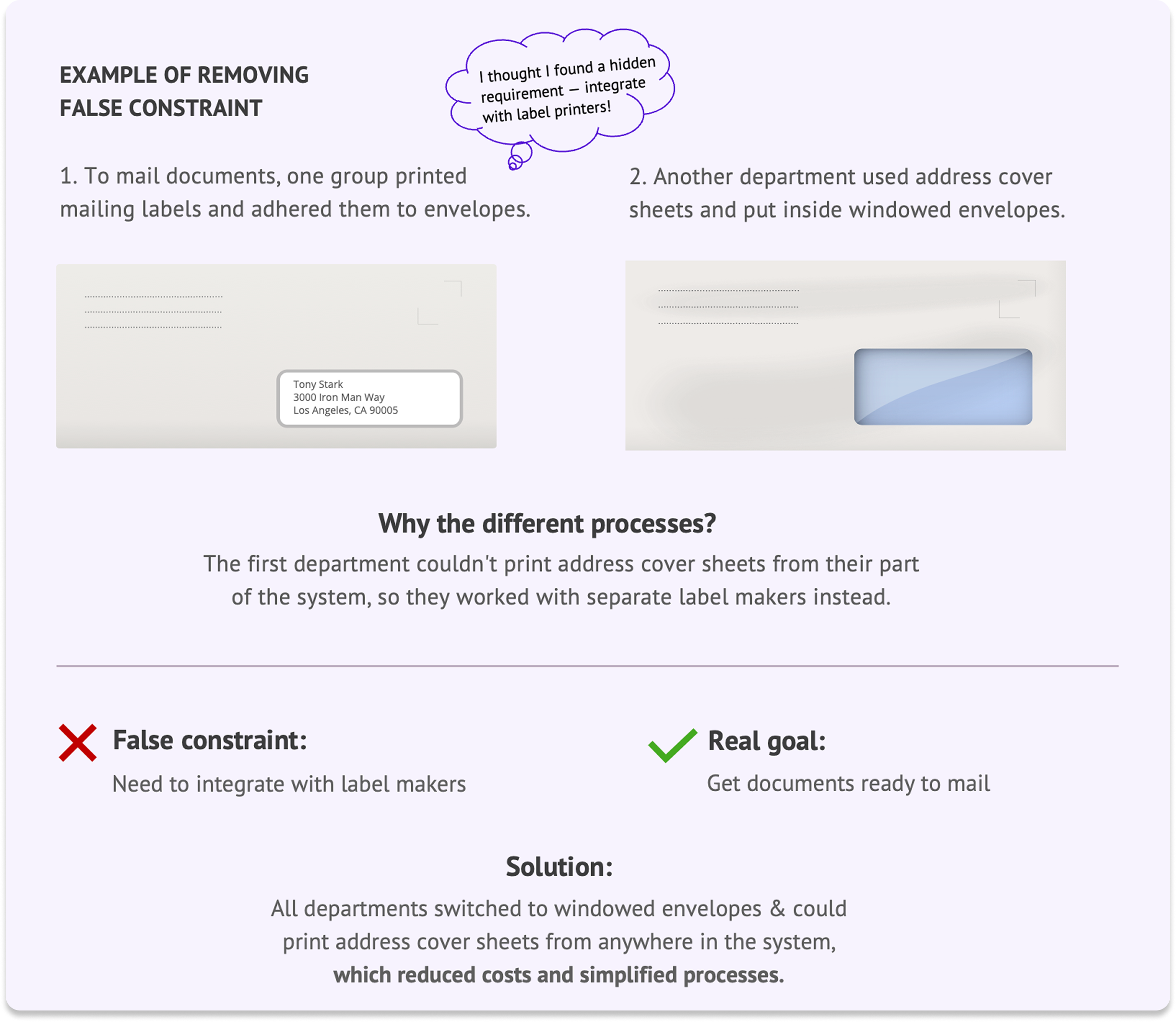
As a result of solving the right problems by refocusing on the “what” instead of the “how,” we reduced costs and simplified processes.
USER RESEARCH
We analyzed the research and created affinity maps, resulting in 12 different personas.

USER RESEARCH
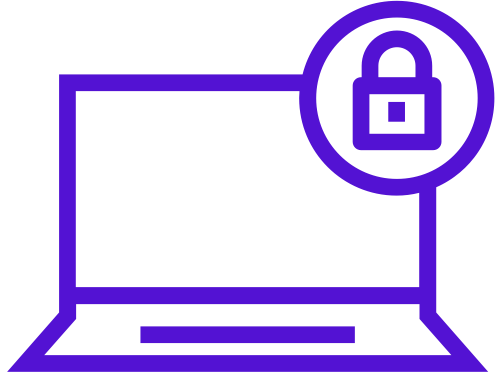
We also documented 11 key workflows, discovering that even the simplest tasks were overly complicated.
This was the workflow for sending a message.
WAY too many steps!
Product Strategy
I led 3 strategy workshops where we created 6 high-level objectives for designing a seamless end-to-end system.
Reduce friction within
the system

Provide transparent communication

Automate repetitive & manual tasks

Support faster decision-making
Deliver scalable foundation for future
Ensure secure access from anywhere
PRODUCT STRATEGY
To keep us aligned on a tightly scoped and prioritized MVP, I used the recurring analogy of “building a car.” We shouldn’t be debating things like “cloth” vs “leather” seats — rather asking “do we even need a seat?”


PRODUCT STRATEGY
Guided by our objectives, I created a matrix of over 200 features to definine an MVP we could launch in 24 months.
Experience Design
I led collaborative design sessions focused on solving the problem in the user story, allowing us to quickly iterate on designs and get real-time feedback from the team.
One of the most successful parts of this project was the daily 30-minute design review I led with the full team, PO, and users (when available).
Created continuous project alignment
This highly collaborative approach helped everyone stay on the same page about priorities and process.
Reduced design documentation by 50%
Engineers would know what the system should do from attending sessions, reducing the need for documentation.
Provided opportunities for more user research
We were able to ask more detailed questions about specific parts of the system as we designed them.
Allowed for real-time feedback and input
Users, the PO, and engineers weighed in on designs and feasibility as we iterated through solutions.
EXPERIENCE DESIGN
We created multiple wireframes for each story, and I led collaborative sessions to iterate through the best solution.

Wireframe Option 1 - Sidebar

Wireframe Option 2 - Tabs
EXPERIENCE DESIGN
One of the design challenges we faced was how to display 4 levels of navigation on the same page.
Attempt 1
This sidebar navigation failed to show the proper hierarchy — that levels 3 and 4 are “children” under level 2, and content changes as new level 2 pages are selected. It all felt disconnected.

Attempt 2
The level 2 tabs and level 4 sidebar structure make it easier to see the relationship between all levels by creating a more obvious hierarchy.

EXPERIENCE DESIGN
Docket Clerks needed a way to select and review long documents while maintaining the ability to quickly switch to another document.
I designed a side-by-side view where the document could scroll independently of the document list.

EXPERIENCE DESIGN
One of our big wins was replacing a 3-person Calendar department* with an “easy button” that automated the entire workflow of scheduling trials.
* The employees were retrained and moved to another short-staffed department.

Replaced the previous calendar process with…


A single button!
EXPERIENCE DESIGN
I planned and directed 13 rounds of usability testing, including 4 in-person roundtable sessions where each persona shared their screen as the group worked a case from end to end.


While earlier usability tests were positive, they were focused on siloed tasks for a single persona.
Employees were able to see each others’ challenges and discuss issues as they arose.
It gave us a 10,000-foot holistic view of the system, which highlighted areas where we fell short of meeting user needs.
EXPERIENCE DESIGN

As the designs took shape, I defined a brand guide to create more consistency, which enabled us to go from wireframes to code, drastically increasing our velocity.

Product Launch
The launch was incredibly successful, with minimal critical bugs and full user adoption. The project became a model for how government agencies should partner with software development firms to build digital services.
30%
While earlier usability tests were positive, they were focused on siloed tasks for a single persona.
0-50%
Change in number of cases filed electronically in first month after launch
80%
Taxpayers now representing themselves with a system that’s easier to use and understand
What I Learned
The best way to get buy-in is to bring the users into the design process as early and often as possible
Remove false constraints to get to the heart of a problem
Full team collaboration will always result in a better outcome
Testing individual workflows isn’t enough — you need to test the end-to-end system to get the holistic view
View Other Work
